
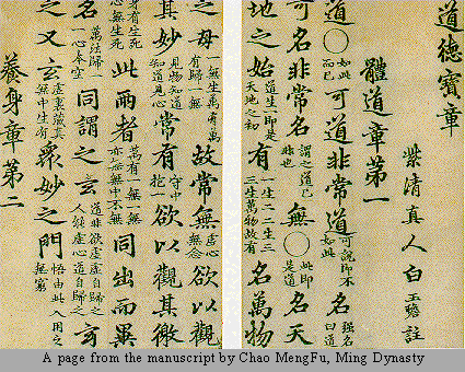
For example, calligraphy is recognizable as a representation of
words, even when we do not know the language. Calligraphic imagery is often
used by modern artists simply because of the mysterious messages implied in the
"code" of unknown language.
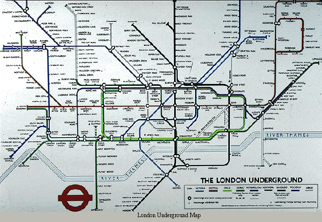 Line in the form of maps is readily recognized as a symbolic
representation of a place. The place may be a local neighborhood, or the entire
world. It may be a carefully measured representation, or a stylized diagram,
such as a subway map. In either case, we understand it to be a device by which
we can understand the relationship between places; how to get from "here" to
"there."
Line in the form of maps is readily recognized as a symbolic
representation of a place. The place may be a local neighborhood, or the entire
world. It may be a carefully measured representation, or a stylized diagram,
such as a subway map. In either case, we understand it to be a device by which
we can understand the relationship between places; how to get from "here" to
"there."
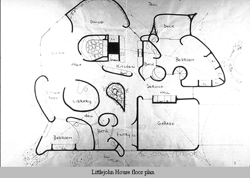
Floor plans are a specialized kind of map, a commonly
understood device which describes a building. This linear language can be understood even when the building is as unusual as this one, which was to be constructed of a sprayed foam material in a decidedly unconventional form.
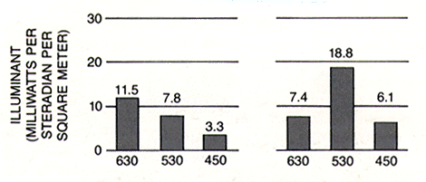
Graphs are another readily recognizable linear device. They are widely
used to communicate quantitative information and relationships in a visual way.
From the time we first meet them in basic algebra, to the last time we picked
up a copy of USA Today, we encounter and interpret graphs.
Line also communicates emotion and states of mind through its character and
direction. The variations of meaning generally relate to our bodily
experience of line and direction.
Horizontal line suggests a feeling of rest or repose. Objects parallel to
the earth are at rest in relation to gravity. Therefore compositions in which
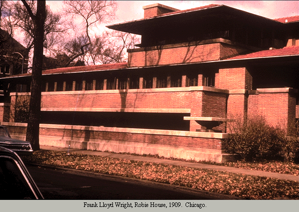
horizontal lines dominate tend to be quiet and restful in feeling. One of the hallmarks of Frank Lloyd Wright's architectural design is its use of strong horizontal elements which stress the relationship of the structure to the land.
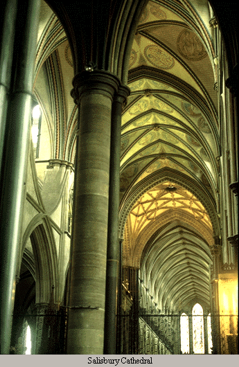
Vertical lines communicate a feeling of loftiness and spirituality.
Erect lines seem to extend upwards beyond human reach, toward the sky. They often
dominate public architecture, from cathedrals to corporate headquarters. Extended perpendicular lines suggest an overpowering grandeur, beyond ordinary human measure.
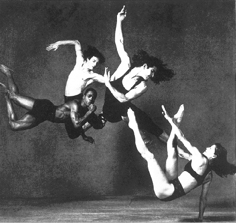
Diagonal lines suggest a feeling of movement or direction. Since objects in a diagonal position are unstable in relation to gravity, being neither
vertical nor horizontal, they are either about to fall, or are already in
motion, as is certainly the case for this group of dancers. In a two dimensional composition diagonal lines are also used to indicate depth, an illusion of perspective that pulls the viewer into the picture. Thus if a feeling of movement or speed
is desired, or a feeling of activity or instability, diagonal lines can be used.
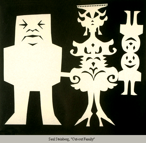
Horizontal and vertical lines in combination communicate stability and solidity. Rectilinear forms stay put in relation to gravity, and are not likely to tip over. This stability suggests permanence, reliability and safety. In the case of the man in this family group, the lines seem to imply stability to the point of stodginess.
Deep, acute curves, on the other hand, suggest confusion, turbulence, even frenzy, as in the violence of waves in a storm, the chaos of a
tangled thread, or the turmoil of lines suggested by the forms of a crowd. The complicated curves used to form the mother in the family group shown above suggest a fussy, frivolous personality.
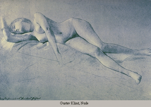
Curved lines do vary in meaning, however. Soft, shallow curves suggest comfort, safety, familiarity, relaxation. They recall the curves of the human body, and therefore have a pleasing, sensual quality.
 The quality of the line is in itself a fundamental visual language,
to an extent that cannot be claimed for other single element. Its use is so
universal that we are all profoundly sensitive to it. Even without an artist's
training, we can extract considerable meaning from the kind of line used in
a drawing. It is possible to recognize the soft, irregular lines of a quick
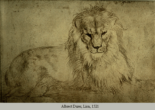
sketch from life, as seen in this study of a lion.
The quality of the line is in itself a fundamental visual language,
to an extent that cannot be claimed for other single element. Its use is so
universal that we are all profoundly sensitive to it. Even without an artist's
training, we can extract considerable meaning from the kind of line used in
a drawing. It is possible to recognize the soft, irregular lines of a quick
sketch from life, as seen in this study of a lion.
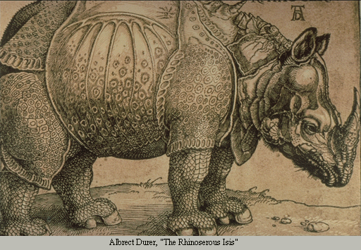
On the other hand, to the crisp, carefully placed lines of the rhinocerous are typical of a more studied, scrupulously worked studio drawing. The lines suggest that this was not drawn from life, but from hearsay. This is also evident from the fact that Durer drew this rather inaccurate image in fifteenth century Europe when he could only have known of this African animal from travellers' tales.
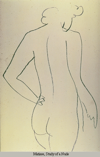
The quality of line in itself contributes to the mood of the work, and for the master artist, the quality of line is a fundamental expression of his/her style. This drawing of a nude by Matisse demonstrates his ability to create his image through a minimal number of expertly placed lines-lines that by their placement and movement on the page identify this work with this artist as surely as a signature.
 |  |