
The word color is the general term which applies to the whole subject - red, orange, yellow, green, blue, violet, black and white and all possible combinations thereof. Hue is the correct word to use to refer to just the pure spectrum colors. Any given color can be described in terms of its value and hue. In additon, the various physical phenomena and pyschological effects combine to affect our perceptions of a color.
Value is defined as the relative lightness or darkness of a color. It is an important
tool for the designer/artist, in the way that it defines form and creates spatial illusions.
Contrast of value separates objects in space, while gradation of value
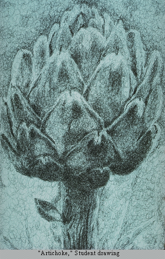
suggests mass and contour of a contiguous surface. In the drawing on the right, value contrast separates
the artichoke from the background, and the separate leaves from one another, while gradation suggests the
curves of leave surfaces and of the whole form.
 Hue also has value. When contrasting hues are made similar in value, the spatial
effects are flattened out. The pair of images on the left demonstrate this.
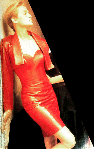
In the color image of the fashion model the coat draws our attention through
contrast of hue although the skin tones blend with the background(remember the
object of the image is to sell the coat, not the model). However, it also seems
to be softly blending with a background that seems quite close, and is very
similar to the coat in value. The face tends to blend with the background which
is similar in both hue and value. In the black and white version, however, the
coat virtually disappears, since only value, not hue, are available to distinguish
it, and the values are quite similar. However, the strong value contrast of
the eyes and hat draw our attention to the face, even though the contours of
the face seem to melt into the background. Therefore the black and white version
emphasizes the model more than the garment.
Hue also has value. When contrasting hues are made similar in value, the spatial
effects are flattened out. The pair of images on the left demonstrate this.
In the color image of the fashion model the coat draws our attention through
contrast of hue although the skin tones blend with the background(remember the
object of the image is to sell the coat, not the model). However, it also seems
to be softly blending with a background that seems quite close, and is very
similar to the coat in value. The face tends to blend with the background which
is similar in both hue and value. In the black and white version, however, the
coat virtually disappears, since only value, not hue, are available to distinguish
it, and the values are quite similar. However, the strong value contrast of
the eyes and hat draw our attention to the face, even though the contours of
the face seem to melt into the background. Therefore the black and white version
emphasizes the model more than the garment.
To summarize: If values are close, shapes will seem to flatten out, and seem closely connected in space; none will stand out from the others. If values contrast, shapes will appear to separate in space and some will stand out from the others. This works whether the colors are just black, white and gray, or whether hues are involved.
 Hue is the term for the pure spectrum colors commonly referred
to by the "color names" - red, orange, yellow, blue, green violet - which appear
in the hue circle or rainbow. Theoretically all hues can be mixed from three
basic hues, known as primaries. When pigment primaries are
all mixed together, the theoretical result is black; Therefore pigment mixture
is sometimes referred to as subtractive mixture.
Hue is the term for the pure spectrum colors commonly referred
to by the "color names" - red, orange, yellow, blue, green violet - which appear
in the hue circle or rainbow. Theoretically all hues can be mixed from three
basic hues, known as primaries. When pigment primaries are
all mixed together, the theoretical result is black; Therefore pigment mixture
is sometimes referred to as subtractive mixture.
The primary colors consist of three hues from which we can theoretically mix all other hues. There are two commonly used definitions of primary colors:
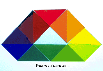
Painters Primaries - red, blue, yellow: This traditional definition of
primaries does not in fact mix to clear greens or purples; it is based on 19th century
theories.
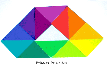
Printers Primaries - magenta, cyan (turquoise), yellow: This definition
of primaries mixes to clear colors across the entire spectrum. It is used as the basis
for color printing. The computer screen probably does not give you a true turquoise--the
color should be a blue-green-- because of differences between color mixture in pigment and color mixture in
light.
In mixing colors hues can be desaturated (reduced in purity, weakened) in one of three ways: mix with white to lighten the value (tint), mix with black to darken the value (shade), or mix with gray or the complement to either lighten or darken the value ( tone).
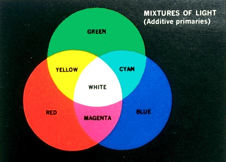 Light Primaries - red, blue, green. This definition is active
when colored light is mixed, as on your computer screen, or when theatrical spotlights
overlap on a white wall. Its effects are less
familiar than pigment mixture to most people. If all three primaries are mixed,
the theoretical result is white light. Therefore Light mixture is sometimes
referred to as additive mixture.
Light Primaries - red, blue, green. This definition is active
when colored light is mixed, as on your computer screen, or when theatrical spotlights
overlap on a white wall. Its effects are less
familiar than pigment mixture to most people. If all three primaries are mixed,
the theoretical result is white light. Therefore Light mixture is sometimes
referred to as additive mixture.
Your computer screen mixes color as light, and therefore follows additive color mixture rules. Therefore it is possible to check how additive mixture works on your computer screen--try this link to an interactive additive color mixture tool. When you get there, click on the button below the moving primary circles, then see what happens when you slide them around. This means that the depiction of subractive mixture shown here is less than ideal, particularly for the cyan (turquoise) and magenta of the printers primaries.
If you want to see some amazing animations of hue
and value relationships, try going to this link, which will also take you to a good descriptive
explanation of hues and primaries. Also here is a great
interactive test of your ability to distinguish gradations of hue, created by Pantone.
There are many systems for classifying hue, developed so that researchers can measure and define color qualities, and so that designers, industry, and marketing people can communicate color ideas over distance. One example is the Munsell system; another is the Pantone System. However, today the communication of precise color information is mainly done digitally, using spectrophotometers to identify and transmit color information. These digital systems use additive (light) mixture rather than the subtractive (pigment or dye) mixture used in systems like Munsell and Pantone.
Complements are colors that are opposite one another on the hue circle. When complements are mixed with one another in paint, the resuting muted tones desaturate or dull the hues. Such opposite pairs can also be compared in terms of their relative warmth and coolness. Warm-cool contrast of hue can cause images to appear to advance or recede. In this 15th century painting, for example, the warm reds of the man's doublet and his son's cap reinforce the cues of placement to make these figures seem very close. On the other hand, the cool tones of the sea and sky suggest great distance.
Afterimage
is another, more specific definition of complements consisting of a
stimulus color and its physical opposite generated in the eye by
exposure to the stimulus color. Afterimage colors tend to make each other appear more intense, and have
vibrating boundaries.
Some of the effects of color occur only in the eye and brain of the viewer, and are not physical properties of light waves or pigment. These illusions, however, are very powerful, and have enormous impact on our responses to color.
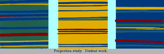 Color Proportion refers to the impact of the relative quantity
of a given hue or value used in color compositions. In order to achieve over-all
unity, and/or create emphasis, one should make a clear decision as to which
colors should be assigned the largest and least areas. The color proportion
choice will also affect the impact of the color composition. This can be seen
in the set of panels shown here. The very same colors are used in each panel.
Yet depending on the choice of dominant color, the feeling of the composition,
and even the appearance of each color, is altered.
Color Proportion refers to the impact of the relative quantity
of a given hue or value used in color compositions. In order to achieve over-all
unity, and/or create emphasis, one should make a clear decision as to which
colors should be assigned the largest and least areas. The color proportion
choice will also affect the impact of the color composition. This can be seen
in the set of panels shown here. The very same colors are used in each panel.
Yet depending on the choice of dominant color, the feeling of the composition,
and even the appearance of each color, is altered.

Simultaneous Contrast is the phenomenon which occurs when a color appears to change when seen against a different background. A set of principles were first laid out in the 19th century by Chevreul, a dye master for the Gobelin tapestry works, who became an important color theoretician. His principles state that changes in the hue, value, saturation (purity of hue), and area of a background color will alter the appearance of the selected color. The print shown here is made up of wavy bands of colors. Some of the bands extend from the center panel to intrude into areas of contrasting hue in the side panels. These extended bands are in fact the same hue and value throughout, but appear to change from left to right.
If you are interested in further information about how our visual response to color may vary, see this section on optical effects in color.
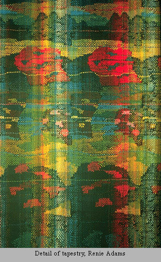 Optical mixture is the phenomenon which occurs when small
particles of different colors are mixed in the eye; this type of mixture
differs from pigment mixture in that it is based on light primaries. However,optical
mixture differs from light mixture in which the primaries will mix to white,
and from pigment mixture, in which the primaries mix to black. In optical
mixture there is an averaging of hue and value, resulting in grey.
Optical mixture is experienced when observing many textiles, such as this
example, a detail from a handwoven tapestry. It can also be seen in natural
objects, color television, and printed color pictures.
Optical mixture is the phenomenon which occurs when small
particles of different colors are mixed in the eye; this type of mixture
differs from pigment mixture in that it is based on light primaries. However,optical
mixture differs from light mixture in which the primaries will mix to white,
and from pigment mixture, in which the primaries mix to black. In optical
mixture there is an averaging of hue and value, resulting in grey.
Optical mixture is experienced when observing many textiles, such as this
example, a detail from a handwoven tapestry. It can also be seen in natural
objects, color television, and printed color pictures.
For a brief video demonstration of optical mixture, try this link.
Red is associated with
blood, and with feelings that are energetic, exciting, passionate or erotic. Most colors carry both positive and negative implications. The downside of red evokes aggressive feelings, suggesting anger or violence.
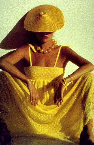
Yellow is the color of sunshine. This color is optimistic, upbeat, modern. The energy of yellow can become overwhelming. Therefore yellow is not a color that tends to dominate fashion for long periods of time.
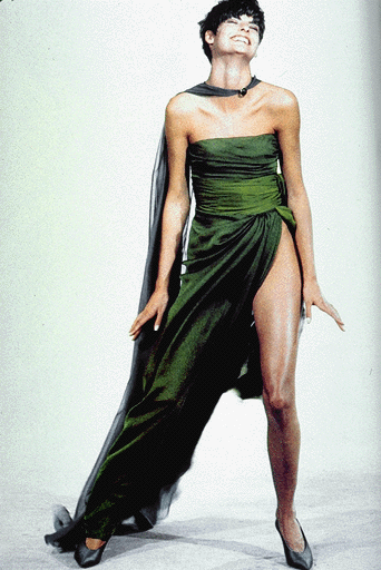
Green In its positive mode, green suggests nature (plant life, forests), life, stability, restfulness, naturalness. On the other hand, green in some tones or certain contexts (such as green skin) might instead suggest decay (fungus, mold), toxicity, artificiality.
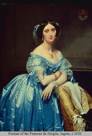
Blue suggests
coolness, distance, spirituality, or perhaps reserved elegance. Some shade of blue is flattering to almost anyone. In its negative mode, we can think of the "blues"-the implication being one of sadness, passivity, alienation, or depression.
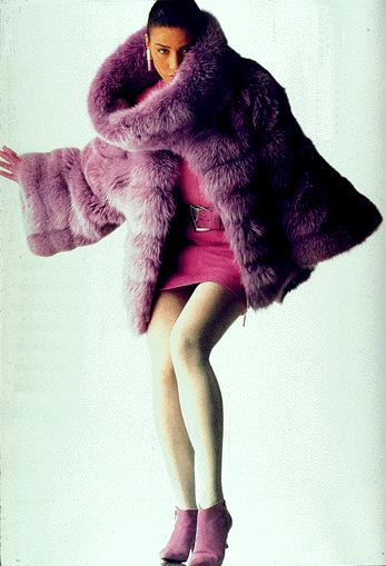
Violet is the color of
fantasy, playfulness, impulsiveness, and dream states. In its negative mode, it can suggest nightmares, or
madness.
Market research on color is also done to establish color trends. Color forecasting is accomplished by surveying consumer preferences and other indicators of changes in taste. Color forecasting firms then issue projections defining palettes of colors that can be expected to rise, fall, or maintain popularity in coming seasons. The design industries then develop their new lines with these projections in mind. Some major companies employ their own color forecasters to research and project color trends for their industry. On the whole, color trends change more rapidly for fashion than for interior design, probably because changes in home furnishings entail a more serious financial investment.
For additional color forecasting information, try these sites:
Trendstop offers a free trends newsletter if you sign up
Pantone's projections for 2014 apparel
A report on color trends in interiors for 2014 (It's hard to get the advance forecasts for free!)
A directory of websites with information on color trends
For a more in-depth look at the psychological implications of color, check out any of the
following: